Want to know more about what we do? Then, you must read the story behind our visual identity.
Learning to see waste and then systematically eliminate it; that’s what we strive for at Zerwaste. Our mission is to turn waste into opportunities by solving operational challenges today and improving circularity for tomorrow. We help you find new sources of operational efficiency to create a competitive advantage, or just optimize your production and services.
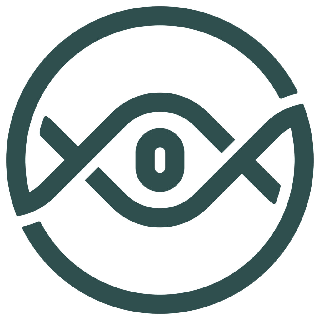
Defining our visual identity and finding the logo that embodies all of what our organization stands for was essential to us.
Will you spot all of them?

Green color: we selected a dark shade of green to portray an opportunity for fresh starts, security, and sustainable growth.
Circle: as wastehunters, we help you transform waste into opportunities to bring more circularity in the linear economic paradigm.
Chain: we address entire value chains to transform and redefine operations and enable “first-time-right” processes.
Eye: as a consulting company, we observe and listen to you, identifying waste, refining processes, and designing sustainable solutions together. It’s all in the eyes, they say!
Zero: the zero symbol is right at the heart of our logo. It refers to the data we use and reflecting our way of working towards zero waste.
We’re not telling you all this just to pat our own backs. This reflects how much consideration goes into every project we work on. It’s just the way we do things!